
LESSON 5. Analyzing MEAL Data
Now that your project is underway, you are following your MEAL plans and collecting your data. But, the data you have collected do not mean much to you and your stakeholders in their raw form. Data become useful when you give them meaning, and this is done through analysis, visualization and interpretation.
Data analysis is the process of bringing order and structure to the collected data. It turns individual pieces of data into information you can use. This is accomplished by applying systematic methods to understanding the data—looking for trends, groupings or other statistical relationships between different types of data.
Data visualization is the process of putting data into a chart, graph or other visual format that helps inform analysis. Data visualization also helps you interpret and communicate your results. Data interpretation is the process of attaching meaning to data. Interpretation requires reaching conclusions about generalization, correlation and causation, and is intended to answer key learning questions about your project.
Lesson 5 introduces the basics of quantitative and qualitative data analysis, visualization and interpretation. It will provide you with a basic understanding of, and the vocabulary to express, these processes with the experts who are usually involved.
These three processes are not usually linear; they don’t follow each other in an orderly process. Instead, they support, inform and influence each other, resulting in data that are rich and useful. Where possible, this chapter indicates where these processes overlap and support each other in the quest for understanding about your project.
| By the end of this chapter, you will be able to:
✓ Explain how your MEAL planning documents guide data analysis, visualization and interpretation. ✓ Describe the purpose and processes of quantitative data analysis. ✓ Describe the purpose and processes of qualitative data analysis. ✓ Describe the purpose and process of data visualization. ✓ Explain how analysis leads to appropriate interpretation and the development of conclusions and recommendations |
5.1 Introduction to data analysis
Data analysis is guided by your performance management plan. A careful review of the PMP will tell you what data you will analyze, when and how you analyze them, and how you will use your results.
How you analyze depends on the type of data. Quantitative data are analyzed using quantitative, statistical methods and computer packages such as Microsoft Excel or SPSS. The results of quantitative data analysis are numerical and easily visualized using a graph, chart or map.
Qualitative analysis is most often done by reading through qualitative data in the form of data transcripts, such as notes from focus group discussions or interviews, to identify themes that emerge from the data. This process is called content analysis or thematic analysis. It can be aided by software, but is most often done using paper, pens and sticky notes.
The timing of your data analysis depends on when it is collected and the timing of your stakeholder information needs. Output-level data change quickly and are thus analyzed more frequently than data at the intermediate result and strategic objective levels of the Logframe.
Data analysis and interpretation often occur before an important quarterly project meeting, reporting deadline or as part of an evaluation. But, many advocate for data analysis and interpretation to be completed more often as part of a MEAL system that proactively uses data. For example, project activities may incorporate discussions involving analysis and interpretation after site visits and during quarterly meetings. There are many benefits to this approach, including better management of challenges and timely learning and adaptation of project implementation.
It is particularly important to coordinate your data analysis with the overall project implementation calendar. Data collection and subsequent analysis, visualization and interpretation activities require time and input from the wider non-MEAL project team. Don’t forget to factor this into your planning. Always remember that your objective is to provide timely, relevant responses to stakeholders, learn effectively, inform required reports, and generally find ways to make your data as useful as possible.
5.2 Quantitative data analysis basics
At a basic level, there are two kinds of quantitative analysis: descriptive and inferential (also known as interpretive):
Descriptive data analysis is the analysis of a data set that helps you describe, show or summarize data in a meaningful way so that patterns might emerge.
Inferential data analysis enables you to use data from samples to make statistical generalizations about the populations from which the data were drawn.
Understanding quantitative data Before you begin quantitative analysis, you need to understand what kind of data you are working with. The kind of quantitative data you have will determine the kind of statistical analysis you can conduct. Understanding your data begins with understanding variables.
Variable Any characteristic, number or quantity that can be measured or counted.
There are two categories of variables, independent and dependent:
● Independent variables are just what they sound like; variables that stand alone and are not changed by the other variables you are looking at. Age, religion and ethnic group are all examples of independent variables.
● Dependent variables are categories that depend on other factors. For example, a dependent variable might be distance walked to collect water or the incidence of waterborne disease.
Different types of variables are measured or counted differently. For example, time is measured using minutes or seconds. Knowledge, on the other hand, could be measured by test scores or by observing changes in people’s behavior. These variables are thus analyzed differently.
Next, proper analysis of your data requires you to understand it in terms of its “level of measurement.” Data is classified into four fundamental levels of measurement: nominal data, ordinal data, interval data, and ratio data.
| Level | Description | Examples | Use scenario |
| Nominal data | Data collected in the form of names (not numbers) and which are organized by category. | Gender, ethnicity, religion, place of birth, etc | Nominal data can be counted, but not much else can be done. Information collected from nominal data is very useful, even essential, as it enables basic descriptions of your project. |
| Ordinal data | Data that have an order to them. They can be ranked from lesser to greater. Scales measuring levels of satisfaction or levels of agreement | Scales measuring levels of satisfaction or levels of agreement | Strictly speaking, ordinal data can only be counted. However, a consensus has not been reached among statisticians about whether you can calculate an average for data collected using an ordinal scale. |
| Interval data.
|
Data expressed in numbers and that can be analyzed statistically | Temperature, time | Distances between data points on an interval scale are always the same. (This is not always the case with ordinal scales.) That means that interval data can be counted and you can undertake more advanced statistical calculations for interval data sets |
| Ratio data | Data expressed in numbers, with the added element of an “absolute zero” value. | Height, weight | This means that ratio data cannot be negative. Because ratio data have an absolute zero, you can make statements such as “one object is twice as long as another.” |
No matter what their type, data are not particularly useful to you in their raw form. You need to analyze the raw data before you can determine whether your program is meeting its targets, use it to make decisions or start to communicate with your stakeholders. To understand the difficulty of using raw data, examine Figure 53, which shows how raw data collected from four respondents to a Delta River IDP Project questionnaire are organized into the project database. The left-hand column shows the code for each respondent. For example, the first respondent from the first village is coded as V1R1. Each subsequent column shows how respondents answered the first six questions of the questionnaire.
| Respondent/ questionnaire identifier | Q1 (Age) | Q2 (Number in household) | Q3 (Use of water points) | Q4 (Daily frequency of water point usage) | Q5 (Distance walked to water point) Q6 | Q6 (Diarrheal incident in last 3 months? |
| V1R1 | 27 | 1 | Yes | 2 | 50 | No |
| V1R2 | 53 | 1 | Yes | 1 | 1000 | N/A |
| V1R3 | 19 | 2 | No | 3 | 400 | Yes |
| V1R4 | 21 | 4 | Yes | 5 | 200 | Yes |
By looking at this data, you can see general trends, but you cannot make any specific statements about findings. And, critically, this table only includes data from four respondents, which makes it relatively simple to see trends. If the table included data from 400 or even 4,000 respondents, your ability to use it would be extremely limited until you had analyzed it.
Analyzing quantitative data using descriptive statistics.
There are three categories of calculations that are used to analyze data using descriptive statistics:
● Measures of frequency Display the number of occurrences of a particular value(s) in a data set (frequency tables, cross-tabulation tables).
● Measures of central tendency Calculate the center value of data sets (mean, median, mode).
● Measures of variability Determine the extent to which data points in the data set diverge from the average, and from each other (range, standard deviation).
Measures of frequency A measure of frequency indicates how many times something occurred or how many responses fit into a particular category. You can analyze frequencies by using two tools: frequency tables and cross-tabulation tables. The tool you use will depend on whether you are measuring the frequency of the response values of a single group (frequency table) or multiple groups (cross-tabulation table).
Frequency table A visual representation of the frequency of values in your data set. For example, the Delta River IDP Project conducted a questionnaire that included a question collecting the following ordinal data:
“I can access the water I require to meet my household consumption needs.”
❏ Strongly agree
❏ Agree
❏ Neither agree or disagree
❏ Disagree
❏ Strongly disagree
The frequency table in Figure 54 provides a simple, easy-to-read summary of the answers given by the entire group of 60 respondents. Frequency tables do not require that a percentage be added, but we have added one in this example to help make the results easier to understand.
| Question: “I can access the water I require to meet my household consumption needs.” | Number of responses | Percentage |
| Strongly disagree | 6 | 10 percent |
| Disagree | 10 | 16 percent |
| Neither agree nor disagree | 7 | 12 percent |
| Agree | 25 | 42 percent |
| Strongly Agree | 12 | 20 percent |
| TOTAL | 60 | 100 percent |
While frequency tables help you analyze the frequency of data values according to a single categorical variable (for example, the 60 respondents to a questionnaire), sometimes you will want to analyze the frequency of responses according to multiple variables. This is where a cross-tabulation table can help.
Cross-tabulation table A visual representation of the frequency of values in an entire data set, including subgroups within the data set.
Let’s return to the previous example from the questionnaire, which asked respondents to indicate their level of satisfaction with their level of access to water for household needs. However, this time, we want to compare the responses of large households (those with five or more members) and small households (those with four or fewer members). Respondents had identified whether they were part of a large or small household earlier in the survey. Using that information, the UNITAS team creates a cross-tabulation table to compare the responses of the two subgroups.
| Question: “I can access the water I require to meet my household consumption needs.” | Response total | Response (large households) | Response (small households) |
| Strongly disagree | 6
10% |
4
16% |
2
6% |
| Disagree | 10
16% |
8 32% | 2 6% |
| Neither agree nor disagree | 7
12% |
4
16% |
3
9% |
| Agree
|
25
42% |
7
28% |
18
51% |
| Strongly agree | 12
20% |
2
8% |
10
28% |
| TOTAL | 60
100% |
25
42% |
35 58%
|
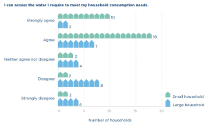
The cross tabulation table and its accompanying bar graph allow you to compare the responses of the two groups. For example, the UNITAS team can see that of the 60 households interviewed, 62 percent strongly agree or agree that they have enough water to meet their consumption needs, which is an acceptable result. However, this percentage can be interpreted somewhat differently when viewed through the perspective of large and small households. Of the large households, only 36 percent strongly agree or agree that they have access to enough water. Of the small households, on the other hand, 79 percent strongly agree or agree that they have access to enough water.
We will revisit the topic of cross-tabulation tables when we discuss inferential statistics. When you combine cross-tabulation tables with the inferential statistical measurements described in the next section, you can start to assess the relationships between multiple variables.
Measures of central tendency One of the most common ways to analyze frequencies is to look at measures of central tendency.
Measures of central tendency help identify a single value around which a group of data is arranged. There are three tools used to measure central tendency:
Mean The average of a data set, identified by adding up all the values and dividing by the whole.
Median The middle point of a data set, where half the values fall below it and half are above.
Mode The most commonly occurring answer or value. To illustrate the differences between mean, median and mode, let’s use another data set collected by the Delta River IDP Project. You will remember that one of the indicators for the project is: “By Year 3, 85 percent of IDP households are located no more than 500 meters from a water point.” To track this indicator, project staff conducted field visits to each village where the project works. The UNITAS team randomly selected 10 IDP households in each village and physically measured how far they walked to collect water. The raw data from the households in village 1 are recorded in the table below.
| Households (village 1) | Distance walked (meters) |
| R1 | 100 |
| R2 | 300 |
| R3 | 600 |
| R4 | 400 |
| R5 | 300 |
| R6 | 700 |
| R7 | 2,000 |
| R8 | 300 |
| R9 | 800 |
| R10 | 100 |
UNITAS can use any of the three tools to describe the way in which the data above cluster around a central value. Note, this is because the distance walked to collect water is ratio data: the data set is expressed in numbers, can be manipulated statistically, and includes an absolute zero measurement (0 meters.)
The mean
The mean (or average) is the most well-known measure of central tendency. To calculate the mean, you add up all the responses to the question about distance walked and divide it by the number of respondents.
(100+300+600+400+300+700+2,000+300+800+100) ÷ 10 = 560 meters
The mean can only be used to analyze numerical (ordinal and ratio) data. However, some people believe you can calculate the mean of ordinal data if you are highly confident that the distance between the points on the ordinal scale is equal. For example, “How satisfied are you with your level of access to water? (1 = lowest; 10 = highest).”
The median
The median can also be used to describe the way data clusters around a central value. Like the mean, the median is used to analyze numerical data. To calculate the mean, complete the following steps:
● Write out all the values in numerical order.
100 – 100 – 300 – 300 -300 – 400 – 600 – 700 – 800 – 2,000
● Then, cross off the first and last numbers in the row until you get to the middle.
100 – 100 – 300 – 300 – 300 – 400 – 600 – 700 – 800 – 2,000
100 – 300 – 300 – 300 – 400 – 600 – 700 – 800
300 – 300 – 300 – 400 – 600 – 700
300 – 300 – 400 – 600
300 – 400
Data sets that contain an even number of values, like this one, will not have a middle value. In these situations, you calculate the median by taking the average of the two numbers at the midpoint of the data set.
(300 + 400) ÷ 2 = 350
The median is not used as frequently as the mean, but it is a valuable tool for double-checking whether the mean provides a fair representation of the data. If you find that there is a large difference between the mean and the median, then it could be a sign that there are outliers (unusually small or large values in the data set) that are skewing the mean.
The mode
The mode states what is the most commonly occurring answer or value in the data set. To calculate the mode, write out a frequency table and identify the most frequently occurring response value:
100 meters = 2 responses
300 meters = 3 responses
400 meters = 1 response
600 meters = 1 response
700 meters = 1 response
800 meters = 1 response
2,000 meters = 1 response
Mode = 300 meters
Which measure of central tendency should you use?
At this point, we have used three tools (mean, median, mode) to calculate the way data from
Figure 55 cluster around a central value.
| Mean = 560 meters | Median = 350 meters | Mode = 300 meters |
| What does this mean?
On average, the 10 respondents walk 560m to collect water. |
What does this mean?
Half the respondents walk more than 350m to collect water; half walk less. |
What does this mean?
The greatest number of respondents (3) walk 300m to collect water. |
So, which of these three calculations best expresses the central tendency of this data set? There are three factors that will inform your answer to this question:
● What type of data do you have (nominal, ordinal, interval or ratio)?
● Does your data set have outliers and/or is it skewed?
● What you are trying to show from your data?
As indicated previously, the data set contains ratio data, so we can calculate all three measures of central tendency.
However, notice that the data set from Figure 56 is skewed. More specifically, respondent 7’s data point (2,000 meters) is a significant outlier. This results in a large difference between the mean (560 meters) and the median (350 meters). Outliers have less impact on the calculation of your mean if your sample size is large. However, in this data set, we have a sample size of just 10 households, so the outlier data point from respondent 7 has a large impact on the value of the mean.
The median is especially useful when the calculation of the mean does not fairly represent the center of your data set. This is the case with the data set in Figure 56. When measuring the central tendency of a numerical data set that is skewed, either choose to use the median, or use both the median and the mean together to express the central tendency. In fact, experts suggest that analysis should never use only one measure of central tendency. Measures of central tendency on their own can be misleading. Using two or more brings more clarity to your analysis.
Why not use the mode in the case above? The mode is not commonly used to analyze numerical data sets. However, there are other types of data sets (like nominal data) that can only use mode to measure the central tendency.
For example, the Delta River IDP questionnaire asks a question using a nominal scale:
“What is the main source of water for members of your household?”
❏ Piped water
❏ Borehole
❏ Protected well
❏ Unprotected well
❏ Spring
❏ Rainwater
❏ Surface water (river, lake, pond, stream, canal)
❏ Other?
You cannot describe the typical response to this question by calculating the mean or the median, because each response option is equal in ‘value’ and the choices are not listed in an order. However, calculating the mode for a nominal scale’s data set could be very useful because it identifies which response is answered with greatest frequency.
Measures of variability Measures of variability are the third set of calculations used to analyze data using descriptive statistics. They tell you the spread or the variation of the values in a data set. Are the responses very different from each other over the scale of possible responses or are they clustered in one area? In this section, we will use two tools to calculate the variability of the data set: the range and the standard deviation.
The range
Range The difference between the lowest and highest values of a data set. The range is easy to calculate by subtracting the lowest value in the data set from the highest value. In the case of the Delta River data set, the longest distance walked is 2,000 meters, and the shortest distance is 100 meters. Thus, the range is 1,900 meters.
2,000 – 100 = 1,900 meters
Remember, the average distance walked to collect water is 560 meters, so the range in this data set is relatively large; almost three times the average distance walked. In situations like this, it can be useful to state the range and the mean together: “The average distance walked to collect water is 560 meters, with a data set range of 1,900 meters.
The standard deviation
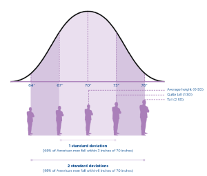
Standard deviation calculates how far responses differ (deviate) from the mean (average).
A high standard deviation indicates that the data set’s values differ greatly from the mean. A low standard deviation means that values are close to the mean. A zero standard deviation means that the values are equal to the mean.
For example, if the average height of an American man is 70 inches, with a standard deviation of 3 inches, then most men have a height between 3 inches taller and 3 inches shorter than the average (67″–73″). You can analyze your data by identifying what percentage of American men fall within one standard deviation of the mean, two standard deviations, or three standard deviations of the mean.
| # of standard deviations | Height | Percentage of American men |
| 1 SD | 3 inches | 68 percent of American men fall within 3 inches of 70” in height |
| 2 SD
|
6 inches | 95 percent of American men fall within 6 inches of 70”
|
Calculating the standard deviation of a data set is much more difficult than any of the other calculations we have introduced so far, especially by hand. The good news is that most databases include functions for calculating the formula for standard deviations.
| Critical thinking: Including multiple perspectives when interpreting descriptive statistics.
Once you’ve calculated your descriptive statistics, the analysis process is much richer and aids learning if you stop at this point and do some basic interpretation. Data interpretation is not something that happens behind closed doors among statisticians, nor should it be done by one person the night before a reporting deadline. Most data interpretation does not require complicated processes, and the multiple perspectives brought through greater participation can help enrich interpretation as well as reflection, learning and the use of information. Any suggested recommendation can look different from the perspective of a field office staff person, a participant, a headquarters staff person, etc. Furthermore, stakeholder involvement can also help build ownership of the follow-up and use of findings, conclusions and recommendations. As you conduct an initial interpretation of your data analysis findings, ask yourself these questions: ● What are the maximum and minimum values for frequencies … what is the range? What do we need to do next with our analysis if the range is very large? ● What is the spread of these values? Are they clustered in any way? Is the mean very different from the mode? If so, what is our next step for analysis? ● What do our contingency tables show us? Are there any interesting differences or similarities between the subgroups identified in our PMP? |
Inferential analysis Descriptive statistics may be enough to satisfy your analysis needs. However, it is likely that you will need to know more, especially when you are evaluating your results. You will want to know whether the patterns you see in your sample can be true for the wider population. And, you may want to be able to show, statistically, whether the project is causing the changes you are seeing. This type of analysis is done by calculating inferential statistics.
It is important to note that inferential statistics are only possible when you have a good random sample that generates high-quality data. In particular, demonstrating causation is usually only possible when your MEAL system is designed to facilitate this analysis. Inferential statistics require additional skills, and they provide some very interesting understandings of your results.
Inferential analysis helps you:
1. Compare the significance of differences between groups: Determining whether the differences that exist between subgroups are large enough to matter.
2. Examine the significance of differences between variables to determine correlation and, potentially, causation: Determining whether your activities contributed to the changes you are seeing.
This is the point at which you will need to consult the statistical experts on your team. The purpose of this section of the guide is to describe these statistical tests so that you know what is possible. This will help ensure that your sampling plans support your analysis needs.
1. Exploring the significance of differences between subgroups: t-tests, analysis of variance (ANOVA), and chi-square tests help you determine whether the differences between the descriptive statistics for subgroups are significant. Some inferential statistics calculate whether differences in frequencies are significant, while others calculate whether differences in averages are significant. The table below briefly describes these three primary tests used to explore the differences between subgroups. It is easiest to understand these tests by first examining the question they aim to answer.
| Analysis method | Description | Example questions |
|
t-test |
● The t-test compares the average for one subgroup against the average for another subgroup.
● It can also compare differences in averages at two points in time for the same subgroup. ● If the result of the test is statistically significant, you can potentially consider it as a project impact. |
“Is the average distance walked to collect water at the end of the project significantly different from the average distance walked at the beginning of the project?” |
|
Analysis of variance |
● The ANOVA test compares the average result of three or more groups to determine the differences between them. | “Does the average distance walked to collect water vary significantly between villages 1, 2, 3 and 4?” |
|
Chi-square test
|
● The chi-square test works with frequencies or percentages in the form of a cross-tabulation table. ● It helps you see the relationship (if any) between the variables and to know whether your results are what you expect to see. | . You expect that the creation of new water points will improve access to water and thus meet consumption needs for both large and small households. A chi-square test helps you statistically test this expectation by analyzing the information provided in the cross-tabulation table in Figure 55.
“Is there a significant difference between the responses of small and large households to questions about household consumption needs?” “How significant is this difference?”
|
2. Examining differences between variables to determine correlation and causation
The tests described above can tell you whether there is a statistically significant relationship between two groups, which may give you some early indication of the effects of your project. But, the limitation of t-tests, ANOVA and chi-square tests is that they don’t tell you which variables influenced that relationship and which did not.
This is where regression analysis can help.
Regression analysis gives you an understanding of how changes to variable(s) affect other variable(s). “Regression analysis is a way of mathematically sorting out which of those [independent] variables does indeed have an impact [on your dependent variable]. It answers the questions: Which factors matter most? Which can we ignore? How do those factors interact with each other? And, perhaps most importantly, how certain are we about all these factors?”
Regression analysis gives you an understanding of correlation. In other words, this type of analysis will give you a sense of how closely your variables are related.
Correlation A statistical measure (usually expressed as a number) that describes the size and direction of the relationship between two or more variables.
For example, regression analysis could possibly tell you the different correlations between the reduction in waterborne disease rates (your independent variable) and the use of two prevention methods: provision of potable water and handwashing campaigns (your dependent variables). The analysis will also give you an understanding of the strength of this correlation. If it is strong, then you can be more confident that your intervention is related to the changes you are seeing.
It is important to note that correlation does not necessarily imply causation.
Causation When changes to one or more variables are the result of changes in other variables.
For example, if your analysis shows a correlation between handwashing messaging, improved handwashing practices, and the reduction of waterborne disease, you can’t necessarily say that your project caused these changes.
It is extremely difficult to prove causation—saying with 100 percent certainty that your project caused a particular change. This is especially true when working in the “real world,” outside of a laboratory environment. There are, however, two strategies that can be used to increase your confidence that causation exists between variables:
Counterfactuals and control groups: The use of counterfactuals and control groups is a strategy usually used in impact evaluations. These evaluations are designed to understand cause and effect between your project and the outcomes you see. The “counterfactual” measures what happens to the “control group,” a group of people who are not involved or impacted by your project. During analysis and interpretation, you compare the results of your project sample with the control group in an effort to demonstrate causation. This kind of study requires a great deal of planning and structure, including a rigorous sampling design. The problem with this strategy is that not all projects have the resources and capacity to design a rigorous impact analysis that includes control groups.
Mixed-method approaches: Many experts believe that a higher level of certainty about causation is possible using a mix of evidence to triangulate your results. For example, you might gather data through a quantitative questionnaire; qualitative semi-structured interviews; and direct, systematic observation at the project site. If these three methods of data collection and the resulting analysis all lead you to the same conclusion, then you have triangulated your data and potentially demonstrated stronger grounds for causation.
Contribution: An alternative to causation
MEAL experts understand how difficult it is to be confident about causation in development settings such as the UNITAS case. As a result, an alternative has been developed called contribution analysis. Those advocating contribution analysis suggest that while causation might be too difficult to prove, contribution is not quite as difficult and can be sufficient for your information needs. Contribution analysis is used in situations where rigorous sampling and data collection processes are not possible and it would be unrealistic to attempt to establish statistical causation. Instead of asking “Did our project cause the changes we are seeing,” these experts ask, “Did our project contribute to the changes we are seeing?”
Contribution analysis is a process of clearly outlining a contribution “story” by transparently following these six steps:
● Clearly define the questions that need to be answered
● Clearly define the project’s theory of change and associated risks to it.
● Collect existing evidence supporting the theory of change (your conceptual frameworks)
● Assemble and assess your own project’s contribution story
● Seek out additional evidence where necessary
● Revise and conclude the contribution story
By following and documenting these steps, contribution analysis can demonstrate that a project contributed to change.
Quantitative analysis errors
As you consider quantitative analysis and the sampling decisions that go along with it, there are two general types of quantitative analysis errors you need to be aware of, a Type I error and Type II error.
Type I error Wrongly concluding that your project has had an effect on the target population when it has not. This is also called a false positive. In the UNITAS example, a Type I error would be to state that the creation of new water points reduces waterborne disease among IDPs when it actually does not.
Type II error This is the opposite of the Type I error. This occurs when you wrongly conclude that your project has not had an effect on the target population when it actually has. This is also called an error of exclusion or a false negative. In the UNITAS example, a Type II error would be to state that the creation of new water points does not reduce waterborne disease among IDPs when it actually does.
Type I errors (false positives) are problematic when you are considering expanding your project on a large, expensive scale. UNITAS is considering expanding the program to create new water points in other IDP areas. Before expanding the program, the team will want to be as sure as possible that that new water points and handwashing promotion results in improved handwashing practices, and thus reduces the incidence of waterborne disease.
To avoid Type I errors, you will want to plan for a smaller margin of error and a higher confidence level when you select your sample from which to collect data.
However, be careful not to set your requirements too high. This can lead to Type II errors, where you fail to recognize important factors that make a difference to your population or project implementation. One way to reduce the risk of making a Type II error is by increasing your sample size. But, this has implications on your budget that must be considered. Even small increases in sample size can dramatically increase your budget.
5.3 Qualitative data analysis basics
Qualitative analysis is working with words that combine to become ideas, opinions and impressions. There are fewer rules, and approaches vary. In general, the objective of qualitative analysis is to identify key themes and findings, including among subgroups if you have them, from all the notes you have collected from your interviews and focus group discussions.
Qualitative analysis is often called “content analysis” and requires multiple reviews of data (your content) so that the data becomes more manageable. The process of becoming familiar with the data will generate themes, which you will use in your analysis. Conducting multiple reviews of the data is particularly important in qualitative analysis, because you need to know your data very well to generate reliable themes and interpretations. Multiple reviews also implies the inclusion of multiple perspectives in the analysis.
Qualitative analysis begins with the raw data, which can take many forms. You might have recordings of interviews. You might have notes from focus group discussions. The raw data need to be organized so that they are easy to review. If you are using well-written notes from interviews and focus groups, you may not need to do much at this stage. But, if you have both recordings and notes, or notes that are difficult for multiple people to review, it will be helpful to do some work with the data before you analyze it. You may need to make a written transcript of your recordings. Or, it might be necessary to rewrite notes that were taken in shorthand. Always make sure that the final document is written in the language that will be used in analysis; for this reason, translation may be necessary.
Once you have organized your raw data, you need to complete the following steps:
Step 1: Code data: Begin to identify themes
Coding is a process that helps reduce the large quantity of qualitative data you have into manageable units. The coding process is iterative, meaning that you will learn as you code content. Reading the data might trigger new ideas, which lead you to review the data again, and thus make new findings. To begin coding, read through all your transcripts at least once so you get a sense of the entire package. During this first reading, you can begin to make notes in the margins of your transcripts to identify themes that you see emerging.
After you have read through the data, read through the information carefully again. You may be comfortable at this point to start adding codes (based on your original notes). A code is simply a category label that identifies a particular event, opinion, idea, etc. Your codes need to be descriptive enough so that people understand their meaning, but not so long that they become difficult to manage.
For example, you might notice that there are different thoughts about the concept of water “meeting my household consumption needs” that are interesting to you. These can be sorted into categories such as ease of access to water, the specific location of the water point, number of times the water point is visited per day, perceived water quality, etc. Your related codes could be: access good, access poor, location good, location poor, etc.
Eventually, these codes will be mapped in a matrix that will help you visualize the data and begin to interpret its meaning. (See step 4.)
There are competing theories about coding, which cannot be covered in this guide. However, it is useful to consider the differences between deductive coding and inductive coding.
Deductive coding is an approach to coding in which codes are developed before the data is reviewed. During the review, the codes are applied to the data.
Inductive coding is an approach to coding in which codes are developed as the data is reviewed, using the specific words used by participants themselves. Codes are built and modified during the coding process itself.
Deductive coding uses labels in your data that relate to the questions you asked in your tool, which, of course, relate back to the indicators in your PMP and the questions in your evaluation terms of reference. Inductive coding, on the other hand, means that you create codes based on the themes that emerge naturally from the participants’ experience as recorded in your data. In this case, you are using the participants’ own words to create your codes.
It is useful to practice both of these coding methods. Deductive coding can help you organize your codes and analysis, while inductive coding helps you identify new ideas. Deductive coding rarely identifies all of the codes you will need before you analyze your data. That is the beauty of qualitative analysis; it raises many interesting themes and understandings that you may not have thought of before.
For that reason, use a mix of both deductive and inductive coding to arrive at the most comprehensive results.
Step 2: Index data
As you begin reading your transcripts, you may need to match concepts and relevant quotations to the codes you have identified. This is called indexing, a step often used when you are sorting through large amounts of qualitative data. When you index your data, you essentially tag the content from your transcripts using the codes from the previous step. Then, you create a list of those tags and where they are in the data in the form of an index.
Once you have indexed your content, you will be able to review your codes and more easily find the different concepts and relevant quotes related to the codes within your transcripts. You will also be able to identify how dense a code is; how often the code appears and where, relative to the other codes you created. Indexing is particularly important if you need to go back to find a noteworthy idea or quotation when you are communicating your results.
Step 3: Frame data
At this point, you begin to put the qualitative data you are working with into a form that can be understood. The most frequently used method of describing qualitative data is a matrix—sometimes called the framework approach—which organizes your data according to categories that are useful to you. The structure of a matrix will differ depending on the type of data collection you are doing. For example, a matrix including data from semi-structured interviews may show the respondent along the left column and the questions along the top row. Responses are included in the box corresponding to the question and the respondent.
Data resulting from focus group discussions may be structured in another way, depending on the nature of the group and your information needs. For example, you could create one matrix for one particular group in one location, another for one subgroup within the focus group in that location, and even one comparing the results of subgroups in various locations.
Figure 59 shows a matrix created to analyze the data collected from questions asked during focus group discussions held in two villages. For each session, the focus group leader asked questions related to household consumption needs and whether the new water points helped meet those needs. The respondents included household heads of both small and large households in each village. (Remember from the previous example that small households are families of four or fewer members and large households consist of five or more members.)
The project team first created analysis matrices for the responses from each focus group in each village, including one for each subgroup. Then, those responses were summarized in this matrix in the field corresponding to their village and size of household.
| Location | Large households | Small households |
| Village 1 | Access: Generally OK, but need to visit water point often during the day.
Consumption needs: No consensus on whether 30 L per person per day is enough. Some require more for washing and cooking than others. Location: Still too far away for some. No consensus. Quality: Smells and tastes different, but generally acceptable. |
Access: Much better than before.
Consumption needs: Meets consumption needs. Consensus that 30 L per person per day is acceptable. Location: New location is not safe for children, so need to send adult or older child to collect water. But happy overall with the fact that it is closer. Quality: Smells and tastes different, but much better than before. |
| Village 2 | Access: All agree that the new water point location is a great improvement.
Consumption needs: 30 L per person per day is definitely not enough for large families. Location: Large families need more water on average and the new location allows them to go more often to get water more easily. Quality: No specific complaints |
Access: Some complain that some families have more access than others in the new location.
Consumption needs: 30 L per person per day meets consumption needs. Location: Not as centrally located as it could be. Quality: No specific complaints |
A matrix helps you visualize and begin to interpret your qualitative data, which allows you to arrive at meaningful conclusions. The qualitative analysis matrix is also a good tool to support your conclusions, which you can show to stakeholders if necessary. Remember as you create your matrix that the number of rows and columns you use will depend on your context, the number of questions you ask, and the type of responses you receive. Imagine an entire wall covered with sticky notes containing coded responses generated by a room full of stakeholders discussing the data. The coding and matrices will help you make sense of all the data.

Qualitative analysis is flexible. You can use or adapt the steps described above to fit your context and situation. Critically, it is just as important to incorporate a wide variety of perspectives into your analysis as it is in the data gathering itself. Thus, many experts advise doing this analysis as a participatory workshop in which you involve different stakeholders.
5.4 Data visualization
Data visualization is the process of showing your data in a graph, picture or chart. Because of the way the human brain processes information, using pictures, maps, charts or graphs to visualize large amounts of complex data is easier than poring over spreadsheets or reports. Data visualization helps share detailed insights into data in the quickest and most efficient way. This helps with:
● Analysis: Discovering relationships between, and patterns in, the data.
● Interpretation: Understanding and reflecting on patterns in the data set and then inferring new information based on that interpretation.
● Communication: Making technical, statistical analysis understandable to people with limited technical knowledge, and sharing your information in ways appropriate to your stakeholders.

Consider following these steps to ensure that your products are effective, especially if you intend to use data visualization to aid communication to stakeholders (in a report, for example):
Step 1: Define the stakeholder(s)
Before designing a visualization, identify the key audience(s). Refer to your communications planning and craft the visualizations according to the stakeholder. Keep in mind that different people have different learning styles.
Step 2: Define the data visualization content
Check your communications plan to determine the “need-to-know” content for each of the stakeholders identified. Then, determine where a visual will be most useful based on your findings, your information needs and the data available to you.
Step 3: Design and test your visualization
Remember to keep it simple. Less is more with data visualization. Do not crowd your visuals with too much data. Get started on paper, with the audience-specific content that was identified. For each key audience identified, different visuals or dashboards may need to be designed. Figure 59 provides examples of the most common data visualization tools.
Step 4: Build your visualizations
Team members with skills and experience in digital software can build data visualizations using the prototypes that were developed in a small group or workshop setting. Some of these visualization tools can be created in Microsoft Excel, if that is the software you are using to organize and analyze your data. For many, however, you will need the assistance of a team member who is skilled in digital software and visualization. Collaboration between digital experts and MEAL staff will be necessary for more complex visualizations.
(a) Bar chart
● Shows multiple responses across different subgroups or points in time. ● Useful when presenting various responses for only a few subgroups or points in time. ● Not appropriate when the responses given are numeric or equal 100 percent in total.
(b)Stacked column chart
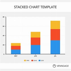
● Shows the variation in multiple variables or options across different subgroups on different questions or different points in time. ● Useful when comparing parts of a whole across different subgroups. ● Not appropriate when the totals do not equal 100 percent or when representing only one subgroup or point in time.
(c)Pie chart

● Shows composition of data set when component parts add up to 100 percent. ● Useful when demonstrating the different subgroups or demographics represented within a data set. ● Not appropriate with multiple (more than five, etc.) data points represented or when the total does not equal 100 percent.
(d) Line chart
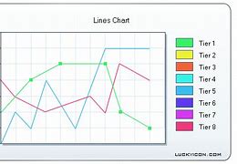
● Shows the trends across different points in time. ● Useful when tracking change over many points in time. ● Not appropriate to show cumulative data or when comparing multiple (more than five) different trends.
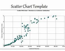
(e) Scatter chart
(f) Line histogram
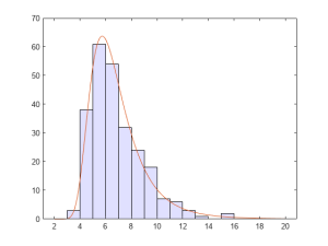
● Shows the distribution with a range of numeric data. ● Useful when looking for the range to accompany an average value. ● Not appropriate when presenting categorical data (data that can be divided into mutually exclusive groups) or multiple responses given or when tracking changes over time.
(g) Data dashboards
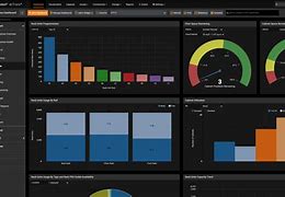
Visually display a collection of key data points to monitor the status of a project. A dashboard can include multiple visualization tools as its subcomponents.
5.5 Interpreting quantitative and qualitative data
Quantitative analysis generates frequencies, averages and levels of difference that exist in your data.
Qualitative analysis identifies themes and patterns. Both types of analysis need to be interpreted to make sense of the information they offer you. Together with your team and other important stakeholders, you interpret your data set by giving meaning to it. The meaning you give it is the story of your project, the story you will use to make project decisions and share your results with others.
As with analysis, your planning documents will help you decide when to interpret. You interpret after you analyze and visualize, although the process is often iterative. Your interpretation can lead to the need for more data collection and further analysis and interpretation, and so on. There is no prescribed process for interpreting data, but there are several recommended practices for improving your data interpretation through enhanced participation and critical thinking.
These include:
● Creating visualizations of your results to help people better understand and interpret your data, making sure your visualizations are used to give the full picture of the data and are not misleading. ● Triangulating your data by presenting the results of both quantitative and qualitative analysis together so that you can compare the results. ● Convening a stakeholder meeting to interpret the data. This meeting should involve stakeholders with different perspectives on the project. The incorporation of multiple perspectives in your interpretation is critical to the creation of information that will be useful and trusted to help the project improve. ● Planning an adequate amount of time to analyze and interpret data. As indicated throughout this chapter, the analysis and interpretation process take time. It is important to ensure that these processes are part of the overall project implementation plan. ● Making sure roles and responsibilities around interpretation are clear. Usually, the MEAL team does the initial analysis while project staff organize and facilitate interpretation events.
As your team and stakeholders undertake data interpretation, you need to consider your interpretation (and subsequent results and recommendations) through the same lenses you used to view data quality.
For example:
● Validity Your interpretation is considered more valid if you can clearly demonstrate that it is based on data that directly supports it.
● Reliability Your interpretation will be considered more reliable if you can demonstrate the consistency of your data analysis methods and their use across multiple data sets.
● Integrity Your interpretation will be considered to have more integrity if you can demonstrate that it is based on data collection and analysis processes that are relatively free of error and bias.

Data limitations to consider during interpretation
Your interpretation process must consider that the type of data you have limits your ability to make interpretations and reach conclusions. Your chosen data collection methods and related sampling designs determine the type and quality (using the standards outlined above) of data you have available. The type of data you have determines the type of tests you can do and, thus, the kind of conclusions and recommendations you can develop. And, while interpreting data, you must always be aware of, and factor into your interpretation, the various types of bias that may be present. There are different types of limitations and bias to consider:
● Limitations related to data type With qualitative data, you must be very clear about the fact that your data represent only the perspectives of the people participating in the focus group discussions or set of interviews. They should not be used to make broad generalizations about the population. However, this information can be used to support other findings, such as those generated using quantitative data.
Quantitative data generate different interpretation challenges. In theory, quantitative data, if rigorously collected and analyzed, can help you generalize and make statements about correlation and even causation. But, quantitative data collection is by nature fairly limited in the breadth of information it collects. “Yes” or “no” answers are clear and concise. But, they do not tell you the whole story. Quantitative data can tell you whether something happened, but possibly not why. Whenever possible, combine quantitative data interpretations with supporting interpretations from qualitative data.
● Limitations related to sampling You now know that there are different sampling methodologies. Your sampling method and size have an impact on the kind of analysis and interpretation you can conduct. For example, random sampling allows you to generalize to the larger population from which the sample was selected. If your results fall within your desired margin of error, you can then make more confident statements about how your project can benefit others.

Purposive sampling, on the other hand, is used to better understand a specific context or situation, usually one in which you are hoping to triangulate data. Sometimes your best efforts to collect data according to your purposive sampling plan are unsuccessful. For example, perhaps you were able to only conduct one focus group discussion with small families while you have three sets of data from larger families. Any results you report must take this situation into account and make it explicit.
Furthermore, any interpretations or comparisons you make relating to subgroups are only possible if your sampling strategy allows for it. If your analysis plans identified groups based on household size, and your collection methods incorporated this stratification (i.e. you collected information from both large and small households) then you will be able to analyze and interpret your data using these subgroups. If your data were not collected in this way, then you cannot make these distinctions.
● Limitations related to data quality With any data, you must be explicit about any existing quality issues and how they might influence your interpretation. The information you collect will never be perfect. Questionnaires will have missing responses, focus group leaders may unintentionally influence respondents, and self-reported responses may be improperly understood. Your interpretation of both quantitative and qualitative data must incorporate your understanding of any data quality issues.

For example, imagine that after implementing the questionnaire in village 1, UNITAS staff found that the concept of “having enough water to meet household needs” was not translated well. The respondents did not understand the question and thus gave responses that did not make sense. This was discovered after a review of the data, and the translation was improved for all future uses of the questionnaire. However, any data gathered about this question from village 1 would need to be treated very carefully and potentially not included in the interpretation. Be transparent about all limitations of your analysis and interpretation. For example, when you write up your findings in a report, be sure to include the limitations alongside them.
● Limitations related to bias Bias has already been mentioned in different settings. Remember that bias can be defined as any trend or deviation from the truth in data collection, analysis, interpretation, and even publication and communication. There are various types of bias, which must be considered during your data interpretation and explained in your communications. It is nearly impossible to eliminate all bias from your MEAL work. However, simply being transparent about these biases increases the trust your stakeholders will have in your conclusions and your processes.
Sampling bias is when certain types of respondents are more likely than others to be included in your sample, as in convenience sampling and voluntary response bias. This bias compromises the validity of your random sample.
Data analysis bias occurs when your analysis includes, intentionally or unintentionally, practices such as: ● Eliminating data that do not support your conclusion. ● Using statistical tests that are inappropriate for the data set.

Data interpretation bias occurs when your interpretation does not reflect the reality of the data. For example, the analysis team may: ● Generalize results to the wider population when they only apply to the group you have studied. ● Make conclusions about causation when the sampling and collection designs do not make this possible. ● Ignore Type I and Type II errors.
Data publication and communication bias This occurs when those publishing or reporting on project results neglect, for example, to consider all results equally, whether positive or negative. For example, there are many published and communicated success stories, but not as many “failure” or “lessons learned” stories.
| Participation: Collaborating with stakeholders to validate data analysis themes and conclusions
Validating, or testing, the themes and conclusions you generate from data analysis is always an important part of the process. There are clear benefits to including multiple stakeholders when validating themes and conclusions. The simplest way to validate data analysis themes and conclusions is by simply asking data sources whether you have correctly captured their opinions and thoughts through the themes you generated. By including multiple, varying perspectives, it is more likely that you will solicit competing explanations of the results you are seeing. One way to promote this dynamic is to ask yourself and others to take on the role of the “skeptic.” This involves asking stakeholders, “What if what I found is NOT true?” Validating your results through multiple stakeholder perspectives can help reveal biases that may have entered the analysis consciously or unconsciously. ● Can you think of an example of when your data analysis themes and conclusions were incomplete or biased? ● Would the results have been improved by incorporating a variety of stakeholder objectives? How? ● What practical steps could you take to collaborate with stakeholders more closely when validating data analysis themes and conclusions? |
Not a member yet? Register now
Are you a member? Login now